Tutorial
-
Using fancy font for your post title
Hallo! Wie geht es dir? Been busy with work without realising it has been two days! I have been doing a blog makeover yesterday and completed book illo #8 previously. Now doing illo #9.
Anyway, let’s get geeky today. Do you want to put a fancy font to your wordpress blog? If you are a proud self-hosted wordpress blogger, good. Here’s how:
1. Download this plugin: Ultimate Google Fonts.

2. Unzip and upload the plugin to your wp-content\plugins directory.
3. Activate the plugin.
4. Go to Settings and look for Ultimate Google Fonts. Click.
5. Choose your fonts. Check the radio box and Save Changes.
6. Type in your CSS code in the CSS box and Save Changes.
7. Voila! You have a new font.
Example of the code, can be like below:
.post h2 a{

font-family:'thefontname',serif;

color: #333333;

size: 30px;

}
Change the size and color value to suit your liking. The font-family code is located at the end of the font you chose, you can just copy and paste in the CSS box.
For blogspot blogger:
1. Check Google web fonts
2. Choose the font you like.
3. Click Use-this-Font tab.
4. Copy the code and put it in the
<head>of your html. Click Design on your Blogger dashboard and choose Edit HTML.5. Don’t forget to copy the CSS code and paste it in your html…anywhere under
#post h2 or h3or something similar. -
Tutorial: 004 Proportion
Hello everybody! It’s tutorial time!
I really hope somebody is following my tutorial. Come on, show me a sign already! If you just bumped into my tutorial, worry not, you can always start from my first tutorial.
This tutorial is in cooperation with Denaihati.com
OK, before I talk more about shades, lets take a look back to our last tutorial. Remember the steps?.
1) draw the faint outline
2) start shading the darkest part
3) add background shade and enhance the overall shade
4) recover the bright area with eraser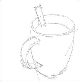
Few friends of mine tried my tutorial and they told me that they couldn’t get it right the first time; to successfully shaping the outline. Everything was out of proportion (cup handle too small, too big, cup too tall, too fat…. etc.) And by the time they got the shapes right, their drawing papers were already in bad shape. To be frank, this happens to me occasionally too. It’s not unusual to have 3 or 4 pieces of drawing papers before I really get it right.
OK, let’s tackle this problem. In the case of this particular subject, what I see generally, is a set of an overlapping ovals.
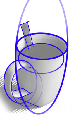
Just look at the relative sizes, angle and position to each other. Look at it as a correlation of shapes instead of a cup of coffee and register it in your mind. This trick might help you get accurate proportion.
Let’s take a look at one more situation here and how I look at it in basic shapes and line. (blue line)

Maybe your observation is different than me and saw more squares or triangles than ovals. Well, its your call.
If you draw from picture, grid line might help you achieve the right positioning and proportion.
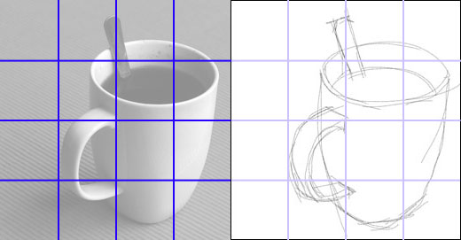
This technique is also a good way to scale up your painting.
Ok, that’s it for tutorial 004. Now, go and get a piece of paper and draw.
If you feel like sharing your drawing, post it on your blog and let me know. I will feature it here.
-
Tutorial: 003 Basic Shading
The idiom “practice makes perfect” is the act of rehearsing a behavior again and again for the purpose of improving or mastering it. So the idiom applies perfectly to drawing and painting too. The more you draw, the better you are. Good thing about drawing is that you can draw anywhere. While waiting to be served in a restaurant, waiting for the LRT to arrive or any other idle time. I used to scribble in a boring group meeting during my 9 to 5 days. Our sketches are just mere expressions of things linger in our mind at that particular time. It’s often meaningless and incomprehensible to some extent. But who cares, nobody is going to mark your scribble.

This is my typical scribbling while waiting for something. The victim will be my sketchbook, notepad, serviette, white space on tabloid, wrapping package or any other materials identified as paper that belong to me.
Well, the serviette will eventually goes into garbage bin, but believe me the skill stuck with you. I strongly advise you to start this habit but hey…please don’t vandalise. If you really want to practice in respond to emilayusof tutorial, your mind will naturally came up with subjects to draw. Let it be shades of an apple, tall post, orang lidi, whatever it is, just start sketching.
In this tutorial I will talk more on basic shading and tool in use is still pencil and pen but guess what, we are going to practice on more complex object, not just cube or sphere like in the previous tutorial.
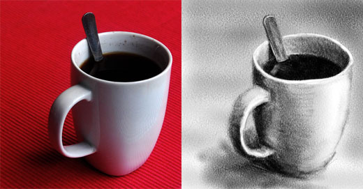
And this is what we are going to sketch; a cup of coffee.

Before we start, lets take a moment to analyze the subject. First, look at the light source. It’s from right and casting a soft shadow to the left. Look at the shade too, (The edge of the cup is bright, the coffee is darker but the outer side of the cup is much less dark because the cup is white….. etc.). Now look at the line and shape that makes the cup. Proportion of shapes to one another. Just memorise the whole scene, so you don’t have to juggle your attention too often.

On your drawing pad, start sketching the most prominent outline. Don’t hesitate to use eraser to redraw the line. At this stage I prefer to use HB pencil which is less contrast.

With darker pencil, start shading the dark area. Well, how much you practice on previous tutorial will obviously be reflected here. The coffee is darker than everything else, so extra pressure on that area. Yes, whatever your eye perceives, make a mental note.

Before you proceed, erase unwanted excessive outline. Add some tone for the background to make your subject outstanding. Smudge with your finger to get smooth effect. Enhance darker area with smoother stroke. When you feel that you have achieved good contrast, smudge with your finger or cotton bud in the area between dark and light to smoothen the tone.
Finally recover the bright area with eraser. You might need to trim your eraser to get finer tips. All the subject involved is reflective in nature. (Spoon edge, coffee surface, cup) Pay extra attention on the reflection and try to get it right. It will certainly make your sketching more realistic.
Two important things to remember:-
One, since you allow yourself to use eraser to erase any mistakes, it doesn’t mean that your sketches will be better finished. Often your sketches will look dirty, badly bruised and an uneven paper surface if you happily stroke and erase . Limit the use of erase just for recovering and enhancing bright area. Try to stroke right the first time.
Two, smudging with finger. Don’t be happy-smudging too. Smudging with finger often eliminate pencil characteristic although it produce smoother shade. In this sketching I only use finger for the background, shadow area on the table and the side of the cup.
Well, that’s it. Try it out. Use your own set of cup and spoon. Look for a spot in your home where it’s a bit dramatic lighted-up, I’m sure there is one. Get comfortable and start sketching. And if you think your sketch is worth the watch, post it over and share with us!
Do you feel that you do have the talent and need more? Try with a pen. After what you have been through with pencil, this should be easier.

Have a nice creative day.
-
Tutorial: 002 Basic Shading
Ancient people used charcoal to draw on cave wall and left behind an expression lasting for thousands of years. Then some smart guy refined charcoal into graphite, wrapped it with wood for cleaner handling, thus pencil was born. This marvelous invention survived until today because it is the simplest writing tool, cheapest, and even erasable.
Pencil has one big advantage over pen, it can do shade. Isn’t that exciting! Maybe not yet. Well, like I said in the first tutorial, the harder you press the darker you get, and that will be our source of excitement.

Pen, on the other hand, do not behave like pencil, but still, you can get shades by varying spaces between line. The closer the line together the darker you get.

Ok, let’s put both of these medium into practice. Sketch this ball.
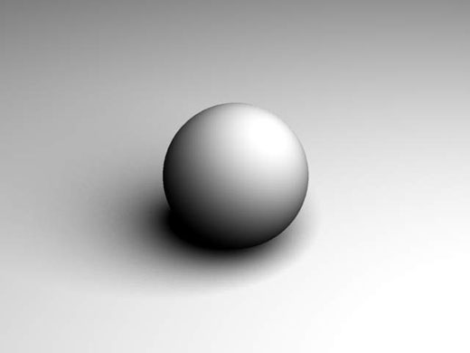
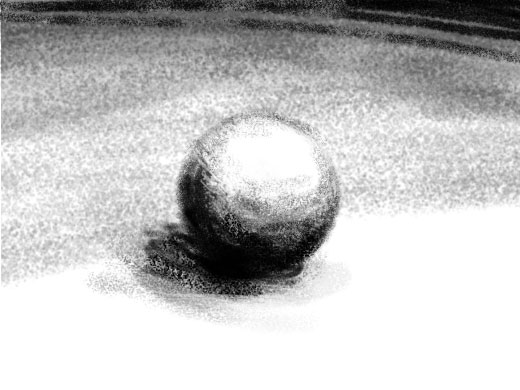
I did this in few minutes and a look bit rough. Try it, just to get familiar with the pressure and result it produce.
Now, try with pen. Vary your line spacing to get different shades.

Also try to mix your stroke with different direction to get denser shades.
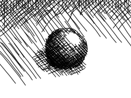
This tutorial is in co-operation with Denaihati.com

See that? Same subject presented in three different mediums. Just look deeply at each one, you can feel the variation of environment and mode. Feel excited about learning how to draw now? Hope you do. Now you know that different medium produces different mode.
Here is another example of linework drawing. Looks familiar?

OK, let’s wrap our class for now, but I really hope my tutorial do trigger your creative side of mind. Don’t worry, I am not very much into terms and jargon or tools used in formal drawing/painting class. Just do it with whatever material available around you. That way it will be more fun.
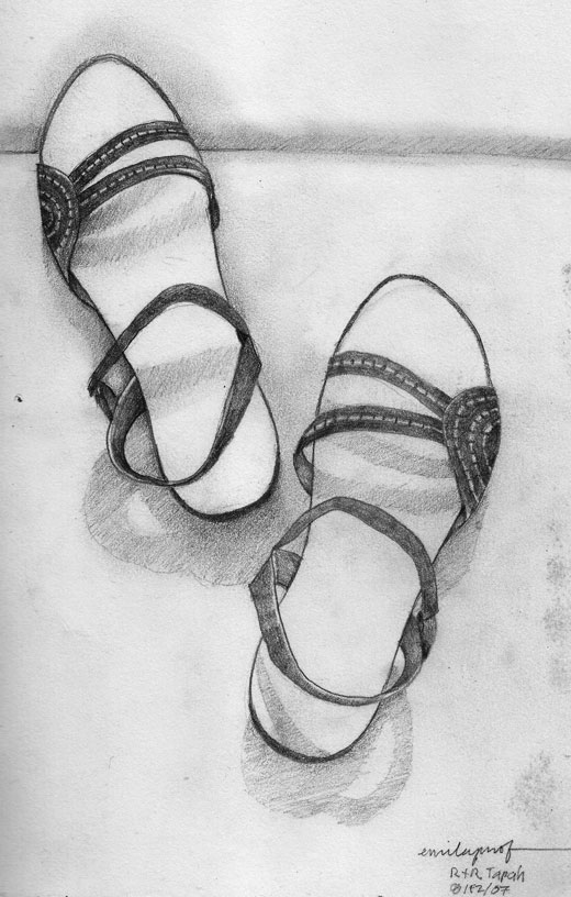
Here is one of my sketches done back in 07 using pencil.
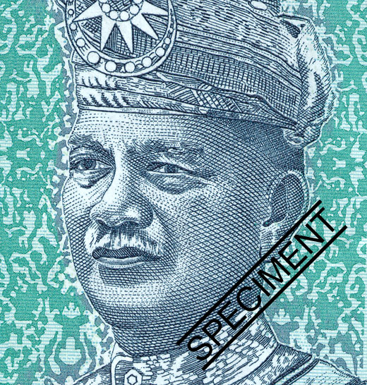
And here is where the above eyes originated from. Have a nice creative day!
Please leave your comment if you have any question about this shading tutorial. Thank you!
-
Tutorial: 001 Pencil Basic Shading
Did you realise when two objects with the same color are put together, you can still make the shape of each one. The reason is how the light falls on its surface. That is the basic knowledge of photography, and painting too. Well, you can call photography, a kind of automatic painting, because what it does is to draw image from the real world to a piece of paper while in painting, you do it manually. And the various imperfections in the process of it creates the beauty of painting.
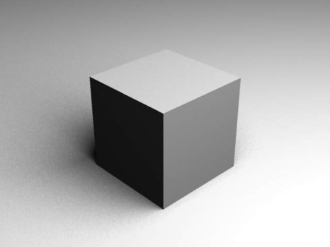
See that cube above? The left surface of the cube that receives less light appears darker even it is the same color?
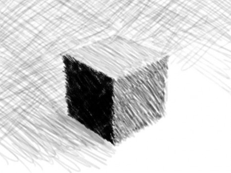
Now how do you draw this? Well, just press your pencil harder for the darker side and a little bit gentle for the lighter side. Ok, lets try it out..
Don’t worry if it doesn’t look right. Painting doesn’t has to look like the real thing. Don’t ever feel bad for what you’ve created, just take an easy look and maybe you can improve on your next sketches. However bad it looks, it will be your trade mark as a painter!
Yes, I have decided to start a basic tutorial about painting. Actually I have received many invitations to conduct classes and talks session about painting. But as you know it, I’ll go blank if I talk. I do feel sad about it, and am working hard to prepare myself for a real talk. For now, this is my first step towards improving my communication skill and at the same time documenting proper learning step in painting. This post will be my Tutorial 001. All will be tagged under Tutorial for reference.You are welcome to try, there will be no age limit and no restriction of any kind. I won’t guarantee that you will become great painter but you will have the basic knowledge, the least!
Please leave your comment if you have any question about this shading tutorial. Thank you!
