Children's Book How-to
-
Penggunaan Warna dalam Buku Bergambar
Warna memainkan peranan penting dalam mempengaruhi emosi. Warna juga bertindak sebagai bahasa universal, di mana kanak-kanak bertindakbalas terhadap warna. Satu perkara yang perlu dipertimbangkan ialah suasana cerita. Apakah warna yang melambangkan suasana atau emosi?
Psikologi warna boleh digunakan untuk mendapatkan kesan dampak pada ilustrasi. Pernahkah anda terfikir, apabila kita melihat langit biru, kita akan berasa tenang? Atau apabila kita melihat bunga matahari, kita akan berasa gembira? Berikut disenaraikan beberapa tindakbalas emosi terhadap warna:
Merah – Bahaya, marah, keterujaan, keberanian.
Biru – Ketenangan, kesedihan,kesejukan.
Kuning – Kegembiraan, keceriaan.
Hijau – Kedamaian.
Hitam- kejahatan, kesedihan.
Merah jambu – simpati, harapan, kasih sayang.
Jingga – Kehangatan, nostalgia.
Putih – Kebaikan, kebersihan atau sesuatu yang suci murni.
Hitam dan Putih – Bersifat semulajadi, imbauan masa lalu, memfokus kepada penceritaan ilustrasi tanpa diganggu oleh warna.Dengan memahami kaitan warna dan emosi, kita boleh menggunakannya untuk ilustrasi buku bergambar. Fahami cerita dan tentukan suasananya, kemudian warnakan ikut kesesuaian.
Berikut saya berikan sedikit kupasan warna dan emosi bagi beberapa buah buku bergambar.
Aimi Tidak Murung Lagi, Zanariah Salam.
Buku ini tentang kesedihan seorang budak perempuan bernama Aimi yang kematian ibu, namun disebalik itu, barang peninggalan ibunya iaitu kamera dapat menggembirakannya semula.
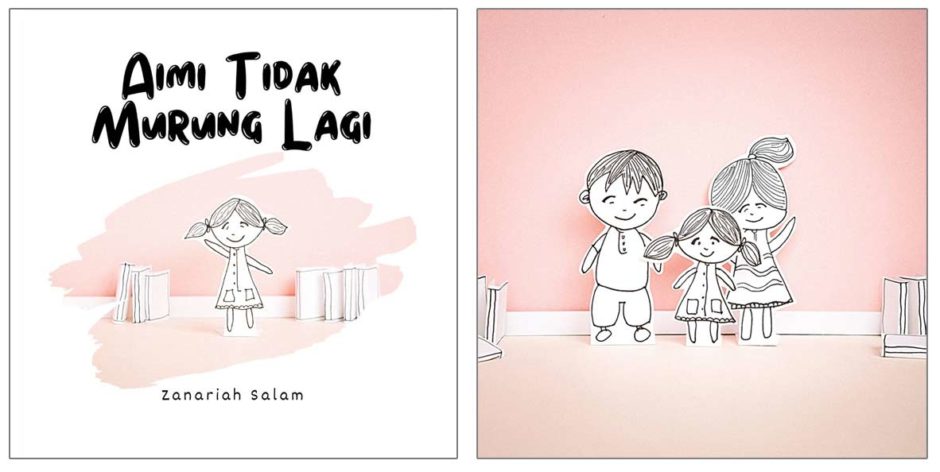
Kredit gambar: Zanariah Salam Dalam ilustrasi cerita ini, ilustrator memilih warna putih dan merah jambu untuk mengekspresikan perasaan dan perjalanan emosi Aimi. Warna putih melambangkan kesederhanaan dan kemurnian, dan dalam konteks ceritanya menggambarkan penerimaan Aimi tentang kematian ibunya.
Merah jambu sering dikaitkan dengan perasaan kasih sayang dan harapan, justeru, dalam konteks cerita ini, merah jambu mencerminkan hubungan emosional antara Aimi dan ibunya, melalui kamera milik ibunya. Warna ini juga mewakili momen kebahagiaan yang baru ditemukan dalam atmosfera yang penuh kasih sayang. Dengan kombinasi warna putih dan merah jambu, ilustrator menciptakan sebuah karya visual yang memperkuatkan perjalanan dalam mengatasi kesedihan.
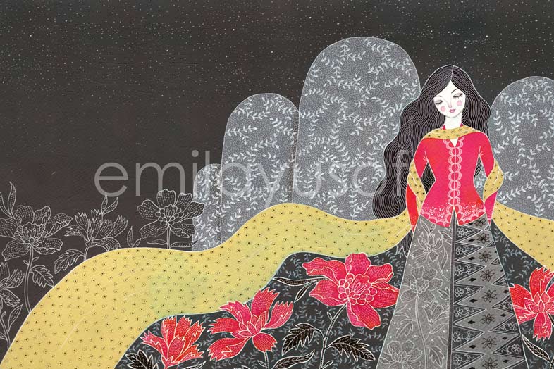
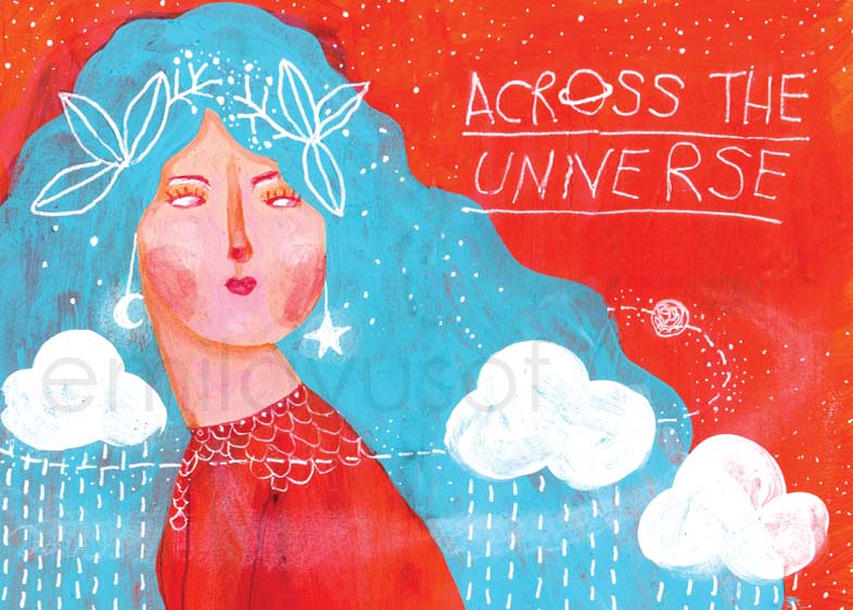
Puteri Gunung Ledang, Emila Yusof.
Buku ini ialah penceritaan semula dari sudut pandang puteri sendiri. Untuk memberikan dampak pada ilustrasi, saya pilih warna tona hitam kelabu, kuning dan merah menyala. Tona hitam kelabu dapat memberikan kesan misterius dan dramatik, menggambarkan sebuah cerita klasik yang epik.
Warna merah menyala saya pilih untuk menggambarkan karakter puteri yang berani dan juga Gunung Ledang yang masih diperkatakan sehingga ke hari ini. Warna kuning selendang bersimbol sebagai semangat positif dan keyakinan untuk menghadapi cabaran.
-
Kepentingan Warna Dalam Buku Bergambar Kanak-kanak
Warna memainkan peranan penting untuk pembelajaran kanak-kanak dan boleh menarik perhatian mereka untuk melihat pelbagai aspek warna dalam ilustrasi. Ini boleh membantu perkembangan minda mereka. Pemilihan warna dalam ilustrasi buku kanak-kanak bergantung kepada gaya dan tema buku, audiens sasaran juga kepada pilihan warna peribadi ilustrator.
Terdapat beberapa kategori warna yang biasa digunakan dalam ilustrasi buku kanak-kanak. Berikut adalah beberapa contohnya:
Warna terang: Buku bergambar selalunya memaparkan warna yang energetik untuk menarik perhatian kanak-kanak.
Ilustrasi Umaral dengan warna-warna terang. Warna pastel atau kurang terang: Warna pastel memiliki lebih tona warna putih. Contohnya warna hijau jika bercampur dengan warna putih akan menjadi hijau muda. Begitu juga pada warna lainnya. Warna-warna sebegini selalunya menggambarkan suasana yang damai dan tenang.
Ilustrasi My Grandma’s Flowering Tea dengan warna-warna pastel. Warna Datar: Warna-warna ini sering ditonjolkan dalam ilustrasi untuk meningkatkan daya tarikan visual dan membantu dalam pengenalan awal tentang warna. Warna datar tidak mempunyai tona gradasi untuk mencipta rekaan yang bersih dan ringkas.
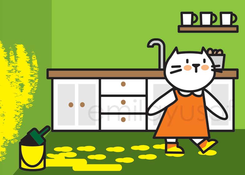
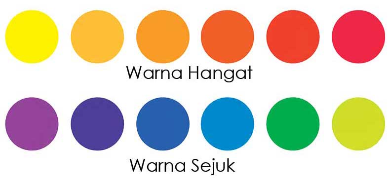
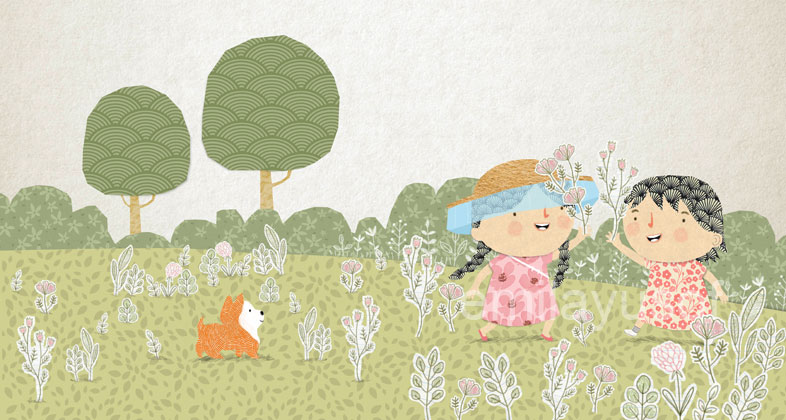
Ilustrasi Mila dengan warna datar. Warna hangat (warm): Warna hangat (contohnya merah, kuning, oren) dapat menyampaikan perasaan gembira, sesuai untuk menceritakan kisah-kisah yang positif dan penuh aksi kehidupan.
Warna Sejuk (cool): Warna sejuk (contohnya biru, hijau, ungu) sering dikaitkan dengan ketenangan dan kesejukan, sesuai untuk menceritakan kisah-kisah yang berlatarkan kedamaian dan pengembaraan. Warna-warna ini juga sesuai untuk menggambarkan keajaiban dalam cerita fantasi atau misteri.
Kombinasi warna hangat dan sejuk juga boleh digabungkan untuk mendapatkan kontras yang menarik dan memperkaya pengalaman pembaca dalam menyampaikan emosi dan nuansa yang sesuai dengan naratif.
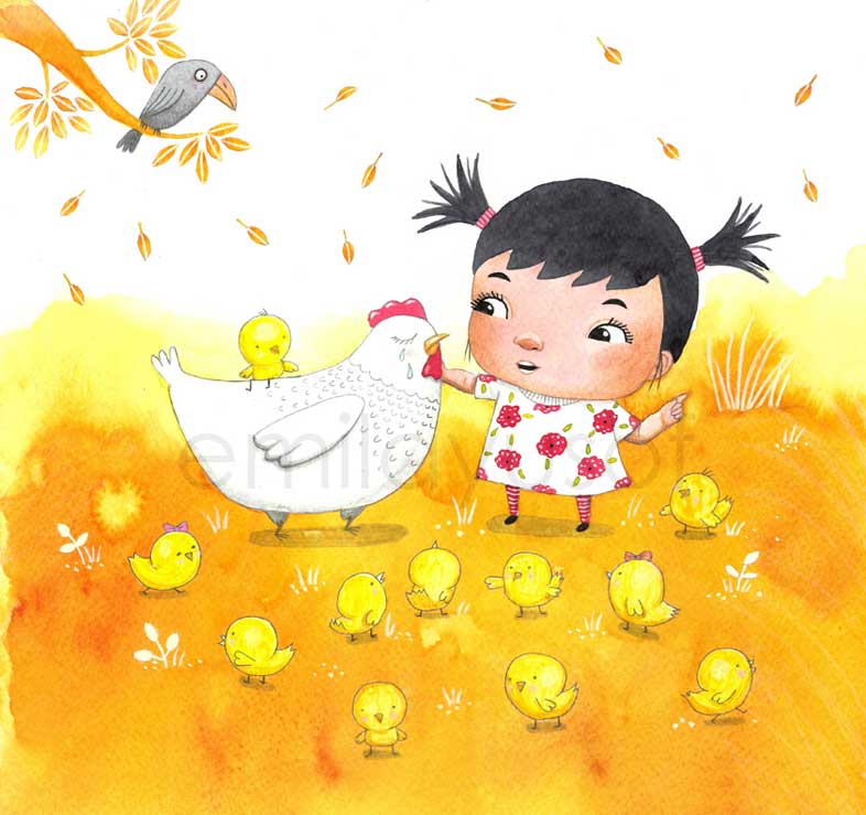
Ilustrasi Pelangi Pagi dengan warna-warna hangat. 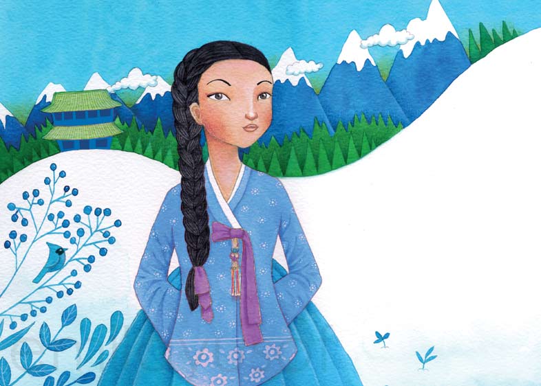
Ilustrasi Puteri Seonhwa dengan warna-warna sejuk. 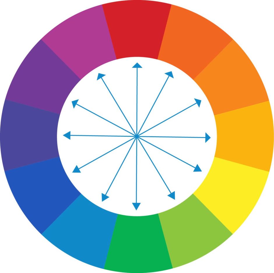
Warna kontras: Warna kontras merujuk kepada warna yang berlawanan (complement) dalam roda warna. Warna-warna ini digunakan untuk menarik perhatian kanak-kanak dan menonjolkan elemen penting dalam ilustrasi. Contoh warna-warna berlawanan bagi biru ialah jingga, bagi merah ialah hijau.
Lukisan dengan warna yang berlawanan. -
Crafting a Dimensional Tunnel Book Illustration from an Old Book
Unlocking the potential of an old book through artistic expression is a creative endeavour that brings new life to forgotten pages. One captivating project that combines imagination and skill is the creation of a tunnel book illustration. In this article, I am sharing the step-by-step process of transforming an aged book into a visually dynamic piece of art.
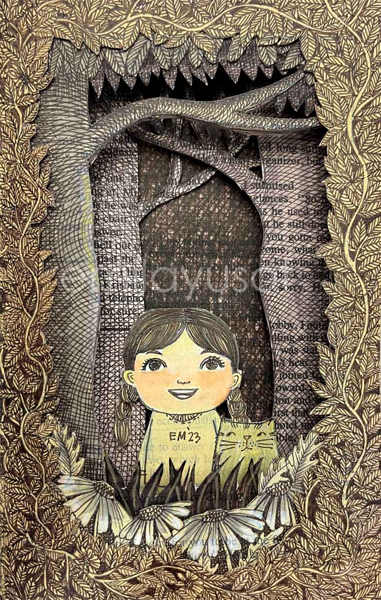
Selecting the book:
Before diving into the intricate process of creating a tunnel book illustration, the first crucial step is selecting the right book as your canvas. The choice between using an old book with its weathered charm or a new book with pristine pages sets the tone for your entire project. An old book may bring a sense of history and nostalgia to your artwork, while a new book offers a fresh start with crisp pages. Consider the size, depth, texture, and overall aesthetic of the book, as it will serve as the foundation for your tunnel book masterpiece. Once you’ve chosen the perfect book, you can proceed with the subsequent steps of planning your artwork and constructing the layers that will breathe life into its pages.Artwork Planning:
Begin by determining the composition of your artwork. Decide how many layers you’ll have for the foreground, middle ground, and background. Plan the elements and their positioning within each layer.Layer Construction:
Glue a few pages together for each layer. Adjust the number of pages depending on the element’s characteristics; for example, use more pages for the trunk to achieve the depth of a tree trunk.Drawing the Foreground:
Start drawing on the first layer, which represents the foreground. Begin with a sketch to establish the composition and details, then refine it using ink to bring your vision to life.Precision Cutting:
Carefully cut out the inside part of the drawn layer following the outlines. Precision cutting ensures that each layer fits seamlessly and contributes to the overall depth of the artwork.Progress to Subsequent Layers:
Move on to the second layer and repeat the process. Sketch, ink, and cut, maintaining a meticulous approach for each layer. Continue this progression until you’ve completed all planned layers.Glueing the Book or Framing:
After completing all layers, consider two finishing options. You can either glue the open side of the book together, create a self-contained tunnel book, or frame it directly in a frame with a depth that matches the book’s thickness. The choice depends on your preference for presentation.End note:
Crafting a tunnel book illustration from a book is a labour of love that merges artistic intuition with hands-on skill. The careful planning, layer construction, and precise cutting result in a visually dynamic piece of art that transforms a neglected book into a captivating narrative. This creative process not only breathes new life into old pages but also showcases the endless possibilities that lie within the realm of book art. -
Ilustrasi dengan kesan vintaj dari helaian buku lama
Berikut saya kongsikan dua ilustrasi yang saya lukis atas helaian kertas lama. Ilustrasi jenis ini boleh diguna pakai untuk tema imaginatif yang berkaitan dengan buku (dalam kes saya, buku lama).
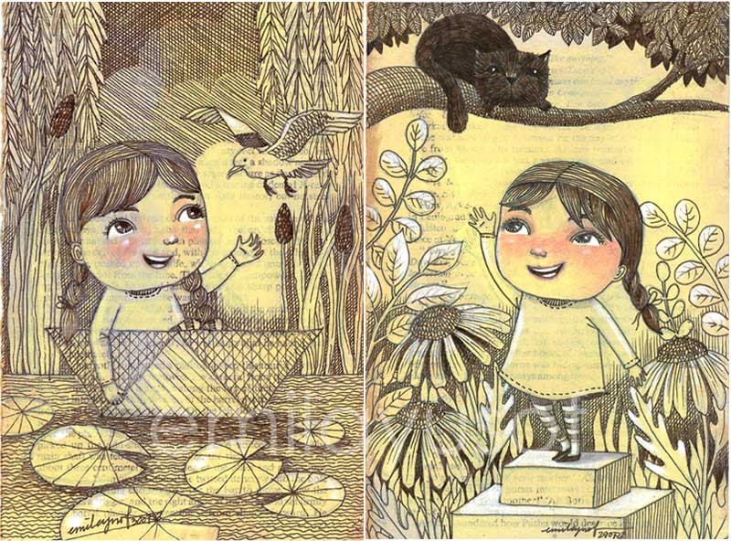
Dina di Alam Buku Lama (working title) Untuk mendapatkan kesan vintaj, saya cat permukaan dengan cat akrilik kuning cair yang tipis atas kertas yang dipotong dari buku lama. Jangan risau sebab buku ini tuannya mahu buang, jadi saya ambil.
Selepas kering saya lukis dengan pensel warna sebelum lukis semula dengan dakwat pigmen berwarna sepia. Saya juga guna pensel warna untuk lukis muka Dina yang comel dan ‘highlight’ pada tempat yang saya rasa perlukan pencahayaan.Tema imaginatif buku lama itu macamana? Begini contohnya jalan cerita saya:
Dina menemui sebuah buku cerita lama di loteng datuknya. Tanpa disangka, dia terseret ke dalam buku itu. Di dalamnya, Dina mengembara ke zaman buku itu diterbitkan (dalam tahun 70an) dan meneroka halaman-halaman yang penuh dengan keajaiban. Bersama teman-teman yang ditemuinya di dalam buku, Dina berusaha untuk mencari jalan pulang yang penuh dengan cabaran. Dia juga berjumpa dengan ayahnya versi kanak-kanak sebab buku itu datuk Dina yang tulis.
Cerita ini saya belum buat storyboard dan masih berlegar dalam kotak fikiran. Ilustrasi ini pun sebenarnya telah terjual. Saya perlu lukis semula nanti.
Demikian bagaimana cerita akan lebih bermakna jika dapat dikaitkan dengan media dan teknik ilustrasi. Teknik lukisan bergaris terkenal di zaman dahulu justeru ini akan menambah kesan nostalgia. Begitu jua dakwat pigmen berwarna sepia atau hitam.
Pelbagai kisah yang sedang menanti untuk ditemukan jika anda benar-benar mahu mencari. Selamat berkarya!
*****
English translation
Illustration with a vintage effect from the pages of an old bookI’d like to share two illustrations that I crafted on vintage sheets of paper. This particular style of illustration lends itself beautifully to imaginative themes associated with books—specifically, in my case, the allure of old books.
To get that timeless aesthetic, I applied a coat of light yellow acrylic paint onto paper sourced from the pages of a discarded old book. Fortunately, the owner had no qualms about parting with it, and so I seized the opportunity. After allowing it to dry, I sketched using a coloured pencil before layering it with sepia-toned pigment ink. These strokes brought to life not only the charming features of Dina but also strategically illuminated areas where I sensed a play of light was imperative.
Now, let’s delve into the enchanting theme inspired by the old book. Imagine this narrative:
Dina stumbles upon an ancient storybook in her grandfather’s attic, setting in motion an unforeseen adventure as she becomes inexplicably drawn into its pages. Transported to the era of the book’s inception (the vibrant 70s), Dina embarks on a mesmerizing journey through pages brimming with wonder. Accompanied by newfound companions within the book’s world, Dina courageously navigates challenges, all the while seeking a path back home. Along this fantastical odyssey, she unexpectedly encounters her father as a child, a poignant connection attributed to her grandfather’s authorship. .
While the storyline remains a fluid concept without a formal storyboard, I sold the original illustrations and had to replicate them later. This narrative gains a richer significance when intertwined with the specific medium and technique employed in the illustration. The classic line drawing technique, reminiscent of a bygone era, imparts a touch of nostalgia, complemented by the sepia or black pigment ink.
Countless tales lie in wait for those willing to explore. Here’s to your creative journey!
-
Unveiling the Artistic Layers of ‘Grandma’s Flowering Tea’: A Digital Collage Odyssey
When I first embarked on the artistic odyssey of illustrating ‘Grandma’s Flowering Tea’ back in 2017, I found myself submerged in a creative process that far surpassed initial expectations. What began as a humble storyboard evolved into an intricate work, spanning over 50 layers for each spread and accumulating an astonishing more than 500 layers throughout the entire book. The decision not to merge layers reflected the foresight needed for future adjustments.
From spread 05-06, Grandma’s Flowering Tea by Emila Yusof. This was submitted for the Little Hakka Illustration competition in Beijing and won the Little Hakka Merit Award 2017. In this blog post, I will delve into the unique techniques employed during the creation of “Grandma’s Flowering Tea,” using it as a case study for the limitless possibilities of digital collage. Peeling back the layers of this endeavour offers a unique glimpse into the intersection of art and technology, where every layer contributes to the richness of the final work.
Sketching on Storyboard
The journey commenced with simple storyboard sketches, laying the foundation for the narrative. Crafting the main characters and establishing the backdrop set the stage for the layout. The decision-making process included determining which elements would benefit from added textures and which would be digitally illustrated.Scanning Sketches
Scanning the initial sketches marked the next step, importing them into vector software (Adobe Illustrator). Each element, from character features to environmental details, was meticulously crafted on individual layers. This strategic layering allowed for flexibility in future adjustments; be it in terms of position, colour, or minor modifications.Prepping the Textures and Patterns
Venturing beyond the digital realm, I incorporated real-world textures such as photographs of my home walls, scanned paper textures, and pages from lined notebooks to capture nuanced details. Seamless patterns were created using Adobe Illustrator, adding depth to the digital canvas.Digital Illustration with Sticker Effect
Attention to detail extended to even the smallest components, such as delicate plants. Opting for a digital approach, I meticulously illustrated each against a white background in Adobe Photoshop. These elements were then carefully cropped, creating a sticker-like image. Back in 2018, I did not have an iPad to work with, so all my digital drawing was done in Adobe Photoshop on my laptop which comes with a touchscreen and a pen.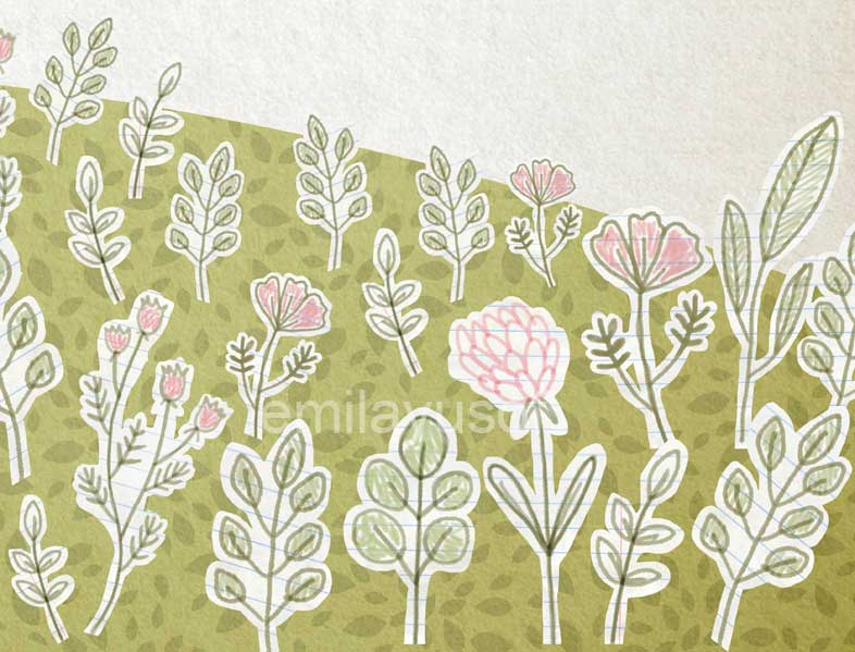
Combining or Masking Texture into Elements
The art of combining or masking textures into elements came into play in Adobe Photoshop. This involved layering textures onto shape layers, creating a visually appealing and textured effect. Grouping layers belonging to the same element facilitated organization, ensuring a streamlined workflow. There is a shortcut for this; put the texture layer on top of the shape layer, press the Alt button, go to the middle line and click it. The texture will fill in the shape. And yes, with the growing technology in digital art, this can be easily done on apps such as Procreate.Paper-Effect Pages
To add an extra layer of authenticity, a faux paper effect was introduced. Scanning watercolour paper or any textured paper, adjusting colours to impart a warm or cool tone, and placing it atop all elements created the illusion of working on textured paper. This detail, when printed on smooth paper, added a tangible and aesthetic dimension to the overall presentation.Conclusion
Digital collage opens the door to incorporating multimedia elements seamlessly. Whether it’s integrating scanned textures, photographs, or hand-drawn illustrations, the digital canvas becomes a dynamic space where various mediums converge. One of the advantages of digital collage lies in its dynamic nature. Layers can be adjusted, elements moved, and colours modified with ease, allowing artists to experiment and refine their creations iteratively. -
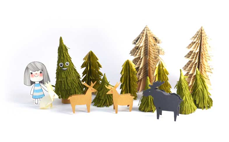
Illustrating Children’s Picture Books with Paper Dioramas
In illustrating picture books, there exists a magical intersection where storytelling and artistry converge to create enchanting worlds for young minds. In this blog post, I am going to share about the creative journey that ventures beyond traditional illustrations; the tactile and imaginative realm of paper dioramas.
With paper diorama, we can create a universe where characters and scenes spring to life, each intricately shaped from the simplicity of paper. I am sharing here two examples of paper dioramas:
– ‘Pipa Gadis Kertas’ which I self-published in 2020 (soon will be re-published by DBP)
– ‘Aimi Tidak Murung Lagi’ self-published by Zanariah Salam, 2022.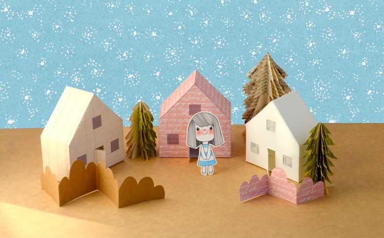
Pipa Gadis Kertas by Emila Yusof. 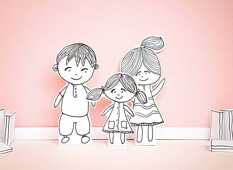
Aimi Tidak Murung Lagi by Zanariah Salam. Let’s dive into the steps to bring this whimsical vision to reality.
1. Conceptualize Your Story:
Begin by weaving a captivating narrative. Outline key scenes and characters that will form the heart of your picture book. Consider how the three-dimensional nature of paper dioramas can enhance the storytelling experience for young readers.2. Design Characters and Elements:
Bring your characters to life with paper! Create delightful paper characters and elements that mirror the essence of your story. Pay attention to details, colours, and expressions that will captivate the imaginations of your young audience.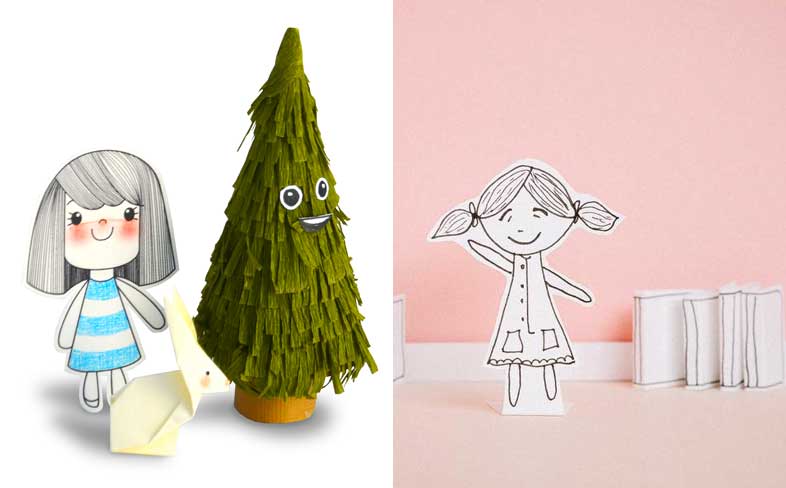
Left: Pipa, Wigle and Uncle Spruce by Emila Yusof. Right: Aimi by Zanariah Salam. 3. Choose Materials:
Select high-quality paper and materials to ensure the durability of your dioramas. Experiment with different textures and colours to make your illustrations visually appealing and engaging for children.4. Create Diorama Settings and Elements:
Build miniature worlds for your characters to inhabit. Craft three-dimensional dioramas that depict the various scenes from your story. Layer elements add depth and dimension, creating a tangible and immersive experience for readers.Utilise techniques such as origami and paper cutting to breathe life into characters and scenes. Origami brings elegant simplicity, while paper cutting allows intricate detailing and layering techniques to add depth to your dioramas. Experiment with textures and colours to engage young readers in a sensory adventure. Assemble these crafted elements into enchanting scenes, capturing the essence of your narrative. Whether it’s rolling hills or charming houses, transform flat paper into dynamic, multidimensional landscapes.
Diorama elements by Emila Yusof. 5. Photograph the Dioramas:
Capture the essence of your paper creations by photographing them. Ensure consistent lighting to maintain a cohesive look. These images will form the visual backbone of your children’s picture book.6. Digital Editing (if necessary):
Consider digital editing to enhance the images further. Adjust colours, contrast, or add any necessary text to create a polished and cohesive visual narrative.7. Layout and Design:
If you are doing the layout on your own, plan the layout of your picture book, strategically placing text and images. Ensure a logical flow, where the illustrations seamlessly complement the unfolding story.8. Test with Your Audience:
Before finalizing your masterpiece, share it with your target audience. Gather valuable feedback from children or parents to make any necessary adjustments, ensuring your picture book resonates with its intended audience.9. Recapturing optional composition/angle:
If you need to adjust the composition, you can do so by rearranging the elements and photographing them again.Conclusion:
By combining the art of crafting with storytelling, you can create a picture book that sparks the imagination and leaves a lasting impression on young minds. Let your creativity soar as you embark on this delightful journey of illustrating children’s stories with the charm of paper dioramas! -
In the Lines of Imagination: The Allure and Artistry of Black and White Illustrations for Children’s Picture Books
Have you ever considered the magic that unfolds within the lines of black and white illustrations in children’s books? While vibrant colors often dominate the shelves, there’s a timeless appeal to the simplicity and artistry of monochromatic drawings that deserves its own spotlight.
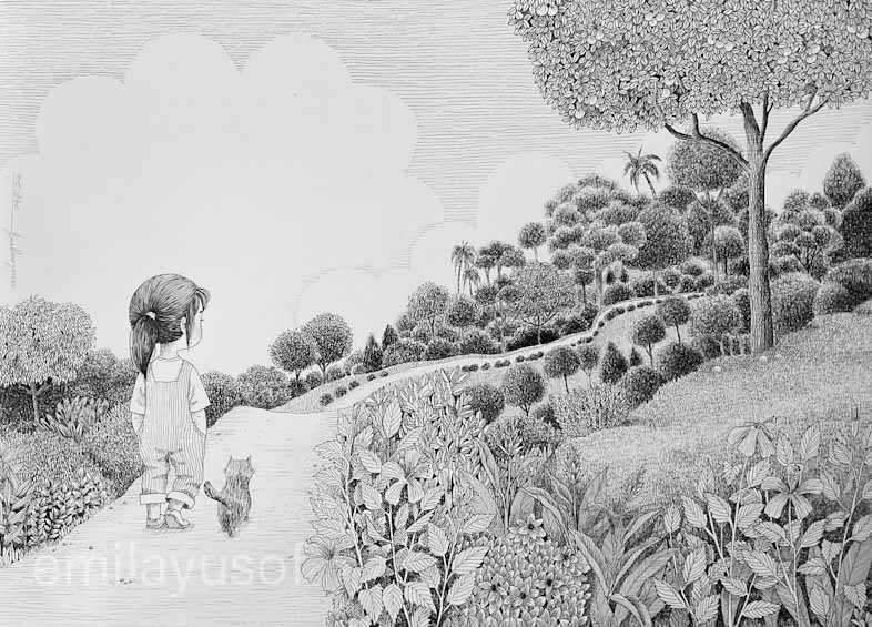
WiP for a picture book. When I was a child, I found myself drawn to the enchanting world of black and white illustrations. Now, even as an adult, I distinctly remember spending hours studying the black and white illustrations in encyclopedias—each line and shading telling a story that seemed to come alive on the page. In those moments, I discovered a visual allure that surpassed the typical images found in textbooks.
In a sea of colors, black and white illustrations stand out with their elegance and simplicity. Stripped of hues, these drawings possess a classic allure that transcends trends, creating a visual experience that resonates across generations. The absence of color distractions allows young readers to focus on the essence of the images, making each stroke of the artist’s pen a deliberate and meaningful contribution to the story.
One of the remarkable qualities of black and white illustrations lies in their ability to spark imagination. With no predetermined colors, children are encouraged to fill in the blanks with their own vibrant ideas. This engagement prompts a deeper connection to the narrative, turning each page into a canvas where young minds paint the story with their unique shades of creativity.
Black and white illustrations extend beyond aesthetics; they hold educational value. The simplicity of these drawings aids in comprehension, making them suitable for early learning materials. The absence of color constraints also makes them more accessible, contributing to inclusivity in children’s literature.
Creating black and white illustrations for children’s books involves a delicate balance between simplicity and expressiveness. Here are basic standards for black and white line drawings that contribute to the success of these drawings:
- Expressive Characters: Characters should convey emotions that resonate with the narrative, adding depth to the storytelling.
- Age-Appropriate Style: Tailor the artistic style to the age group of your target audience, ensuring it aligns with their developmental stage and interests.
- Engaging Composition: Opt for dynamic compositions that guide young readers through the story seamlessly, maintaining visual interest.
- Consistency: Maintain a consistent artistic style throughout the book for a cohesive visual experience.
- Clarity and Detailing: Prioritize clarity in illustrations, ensuring they clearly depict characters, objects, and scenes while balancing appropriate detailing.
- Playful Elements: Infuse a sense of playfulness and imagination, capturing the whimsical nature of childhood.
Closing Thoughts:
As we celebrate the allure of black and white illustrations, let’s recognize the artistry that goes into crafting these captivating visuals. They are not mere lines on a page; they are an invitation for young minds to embark on a journey of imagination. So, open the pages, explore the simplicity, and let the magic of black and white illustrations unfold in the hearts and minds of the next generation of readers.